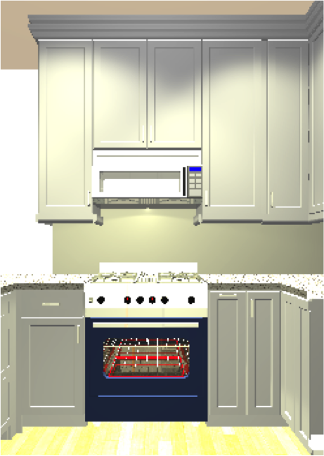
- Keep and paint the lower cabinets, add new uppers, build new peninsula
- Keep the lower cabinets, add new doors/drawer facias, paint the "old", build new peninsula. Add new uppers.
- New upper and lowers, including new peninsula
- All of the above - with current appliances
- All of the above - with new appliances
The clear winner has been new throughout - for aesthetic and functional reasons. And with my new super-duper kitchen designer, Bianca, new throughout is less than 15% more than my maj/min initial quote (ex-appliances).
Aesthetic:
Putting in new uppers, but keeping the "guts" of the old lower cabinets would have been mis-matched…I figured I could live with this, and even considered different paint treatments so to not try to look like this was an accident. However, the old cabinet fronts looked odd with everything new I actually liked, and painting/adding new doors/drawer facias was nearly as expensive as new.
I'd also figured that I'd eventually swap out the fridge…which wasn't counter depth, jutted into valuable workspace, and wasn't a layout I loved. However, the dimensions of any new fridge wouldn't be accommodated well by new cabinetry (upper or lower). I also disliked the existing range/oven configuration…it wasn't one piece (wall oven under counter, large range on the counter)…it looked strange, and the oven was difficult to use without crouching down…probably because it was meant to go in a wall! Given the counters/cabinets would be configured around these appliances, it made sense to select the appliances desired long term before cabinetry was sorted.
There is an existing asymmetrical window partially hidden by drywall and cabinets, and fairly useless given proximity to the neighbor's laundry vents, and a window of their own (about 2 feet!). It lets in very little light. When presented with an alternative layout that eliminated this window, the decision to go with new cabinetry throughout was very easy.
No change to the plans to eliminate the soffett, and lower the peninsula to counter height - adding drawers at the same time.
Functional:
The new cabinetry/appliance/sink layout will make much better use of the space. No major replumbing is required, and the usability of the space will be infinitely better with a sink not locked in an uncomfortable nook. Kudos to kitchen designer Bianca @ Studio 41, who's brain child it was to essentially swap the sink and dishwasher, and to close off the useless window. There is no doubt that with the pull outs and extra storage space, the new cabinets are going to work very well for this aspirational chef who loves to entertain! Every inch of the limited footprint will be maximized - and nothing has been taken away from the adjacent dining space (with full window, and door with window). The trash/recycling will be hidden, the counters will be lit via under-cabinet lighting, and all the appliances will actually "fit".
Before:
Tomorrow:
Picture this with the herringbone backsplash, solid white quartz countertops, and potentially a white breadboard ceiling:
Nothing is going to waste - the kitchen at large has been donated to the Rebuilding Exchange, a beneficial non-profit. The faucet will be utilized in the new laundry room. The microwave was sold, and the dishwasher will stay in the new space…but in a new spot.
In a future post I'll introduce the "accent color" to the kitchen, and the adjacent dining space (essentially one room).


