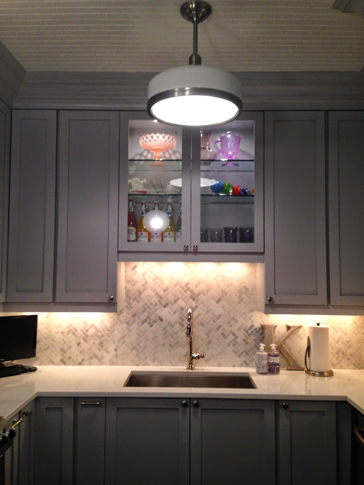
With the gray and white scheme landed pre house-purchase, this project came together pretty quickly once the decision was made for all new cabinetry and appliances. (
Planning - the Kitchen,
Planning: The kitchen overhaul,
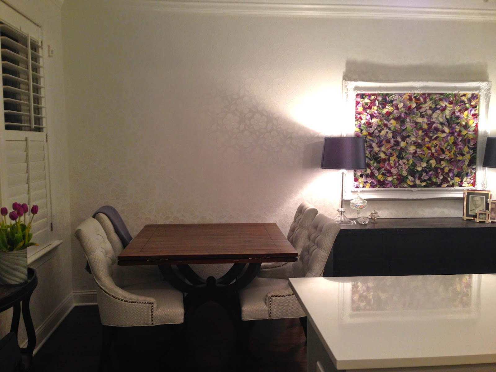
Update: The Kitchen Selections) It's a bright little space during the day with the shutters and shades open - this is when the white on white wallpaper really shines. Although not large in scale, the space is now very functional, aided by 46 inch cabinets, under cabinet power-strips, in-cabinet organizers, and good task lighting. The kitchen/dining didn't grow in size, but it feels much bigger with the pale color scheme, new wood flooring married with the old, bead board ceiling a truly centered layout (I'm big on a center-point) and crown moldings. What a transformation!
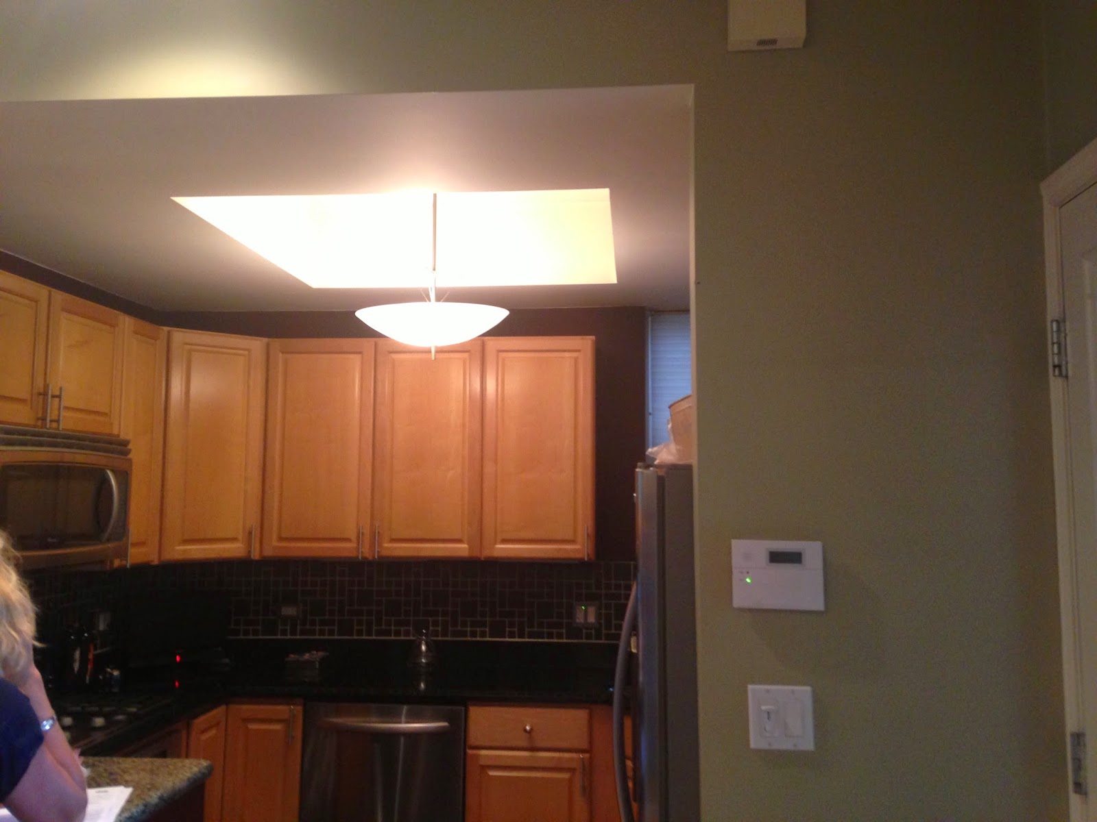
Before: What can I say - there was an elevated drywall/plywood peninsula with cut outs for cat beds. Mismatched granite, a tile floor, a dropped ceiling, no stove ventilation, poorly fitted appliances, and a sink that required one stand in the corner.
After:


No comments:
Post a Comment